A Quick Glance At Conversion Funnels (For The People Who Hate To Read)
The conversion funnel is a way of describing the path a person takes from being a visitor to being a customer. It's called a "funnel" because it starts wide with many people at the top, but only a few make it to the bottom.
Sonu kalwar
Share:
You just had a revelation: your business is losing money. You've done some math and realized that you have more website visitors than customers.
You're not alone. Most businesses have more website visitors than customers, and most of us would love to know how to convert these site visitors into loyal customers.
The conversion funnel is a way of describing the path a person takes from being a visitor to being a customer. It's called a "funnel" because it starts wide with many people at the top, but only a few make it to the bottom. The rest fall out along the way.
By studying the behavior of those who fall out, you can learn what they need to get through your funnel—and turn them into loyal customers!
Try Digital First AI's Plug & Play AI-Powered Marketing Workflows Builder

No credit card needed. Instant access. Try now for free.
The stages of a conversion funnel
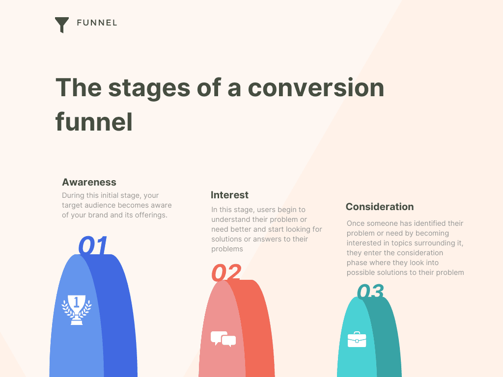
A conversion funnel is a model for the steps that people go through leading up to buying something or opting into your email list. You can think of it as a series of stages, each of which builds on the stage before it.
The stages included in most conversion funnels are: awareness, interest, consideration, intent, evaluation and decision. Here’s how they break down:
Awareness—During this initial stage, your target audience becomes aware of your brand and its offerings. For example, let’s say you run an online business selling wine and beer accessories. During this first stage, someone might see an ad for one of your products while they’re scrolling through Facebook. They might not buy anything right away—they just become aware that you exist and what you sell.
Interest—Next comes interest. In this stage, users begin to understand their problem or need better and start looking for solutions or answers to their problems online—even if those solutions don’t come from you yet! Maybe after becoming aware of your brand in the first stage, that person who saw your Facebook ad now realizes they need a new corkscrew because theirs broke last night when they tried to open a bottle of wine for dinner. So now they search “best corkscorkscrews” on Google and come across several websites that rank highly in Google results (including yours).
Consideration—Once someone has identified their problem or need by becoming interested in topics surrounding it (perhaps by reading blog posts about how to find the best corkscrew), they enter the consideration phase where they look into possible solutions to their problem so far through multiple channels (like organic search results). They might read reviews on Consumer Reports about different types of corkscrews or buy guides from magazines like Good Housekeeping that give advice about which tools work best for opening wine bottles at home… but still haven’t selected one solution over another yet!
Types of conversion funnels
Sales Funnels
A sales funnel is used to help your customers make a purchasing decision. The funnel drives them from awareness to consideration to purchase. Every sale starts with an idea, and then the customer has to process that idea before they make a decision to buy. Your job is to help them through that process so they come out as a paying customer on the other end! You can use your sales funnel in many ways throughout your business - not just as marketing material but also as planning material for your business.
Marketing Funnel
The goal of a marketing funnel is to guide people into becoming loyal customers or brand followers by having them go through various engagement points (such as liking posts, sharing content, watching videos, etc.) before they take any sort of action like spreading the word with their friends online or offline.'
Explore deeper
How to Optimize Your Conversion Funnel?
Define your conversion funnel first
To make your funnel effective, you need to know what the end goal is. If it’s not clear from the start, then you won’t be able to optimize it.
If you already have an established conversion funnel and want to see if there are any opportunities for improvement, then add more steps to the funnel and set up tracking for each step. This will help you identify where in the process people are dropping out of your funnel so that you can act on fixing those issues.
Personalize the customer experience
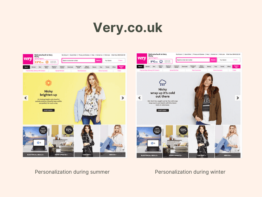
Personalization is the key to attracting and retaining customers. This can be done in a number of ways, such as remembering their name (even if you've only seen it once), tracking their search history, or sending them an email with products they may be interested in. In short, businesses need to treat each individual like they are a person if they want that person to come back and spend more money. Or better yet, become a loyal customer/fan and recommend you to their friends!
Personalization is also important because people are more likely to buy from brands who have taken the time to get their attention first by showing how much they know about them (their likes, dislikes etc.). This can be done through personalized emails and ads that target users based on what type of products or services interest them most often. And no one wants spammy messages! So don't send too many emails at once; instead focus on sending valuable content only when it's relevant for your audience.
Optimize the landing page effectiveness
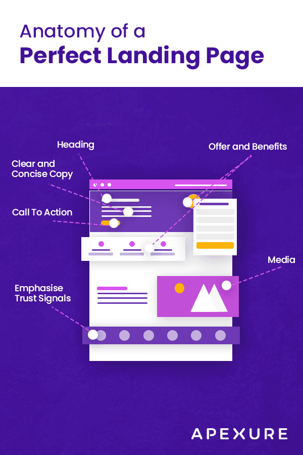
The most important element of any landing page is the headline. It should be relevant to the promotion or ad that visitors clicked on. It should also compel them to take action and visit other parts of your website.
Your landing page’s call-to-action button text should be clear and actionable. Instead of “Submit,” use words like “Get My Free PDF Now!”
Keep your pages free from clutter by including only the most essential elements. It will improve loading times and make it easier for users to focus on what you want them to do.
Make sure your landing pages are well-written and free of spelling and grammar errors at all times.
Improve the checkout process
If the checkout process is too complicated, the customer will leave. Keep it simple.
Offer auto-fills. Potential customers are less likely to enter a formal and advanced checkout process if they have to do extra work. If you offer an auto-fill feature, you save them time and make it more likely that they will complete the purchase.
Use payment processing methods that are secure and reliable. Swindlers and hackers abound on the internet, so make sure your payment processing method is secure enough for both you and your customers to feel comfortable with it.
Don't ask for too much information or present too many options on a single page so as not to overwhelm potential customers or bog down their computers while they're trying to load the webpage.
Simplify navigation
In order to make your website more conversion-friendly, you have to create a smooth navigation system. It's simple. If your visitors can't easily find what they need, they will leave your website frustrated and go look for a competitor who allows them to find products or services with ease.
There are several ways how you can simplify navigation:
Create an intuitive structure. Make sure that the menu is well-organized. The information should be easy to find for anyone taking a look at it without spending too much time searching for it. It's good practice to structure all of the information in distinct categories that appear as drop-downs when hovered over by the mouse pointer on desktops (and as expandable menus on mobile devices).
Add filters based on price, brand, color and so on if you're selling multiple products within one category so that users can narrow down their search results in only a few clicks and not have to scroll through long lists of items or lengthy pages where all the items are displayed at once.
Showcase product photos in large format along with some minimal product descriptions rather than making users click through long pages of text before they get a chance to see what the item actually looks like (or worse yet, only displaying very small images.)
Don't hide important information or make it difficult for users to find it (e.g., placing contact info at least partially within header and/or footer).
Don't overwhelm visitors with too many choices - instead provide just enough options that allow them to explore your website without getting lost in between different sections and subpages.
Create a mobile-friendly experience
Mobile-friendly experience is a must these days. You want to make sure your visitors can access your site from any device, which is why you need to use a responsive design. Once you have a mobile-friendly website, the next step is to make sure the design is clean, easy to navigate and load fast. Website speed should be one of your top priorities in order to optimize the mobile experience.
Being able to access content quickly and easily will increase conversions while unorganized layouts with multiple distractions will confuse users – they’ll leave without taking action. To keep visitors on your site and convince them to take action, don’t forget that it needs to be visually appealing and easy to navigate through all devices!
Optimizing conversion funnel for e-commerce
Cart abandonment is a well-documented problem in e-commerce. The average shopping cart abandonment rate for online retail is 69.57%. That means 7 out of 10 people who place an item in their cart abandon the transaction and don’t make a purchase.
What is Cart Abandonment?
Cart abandonment occurs when a user visits your site and adds items to the shopping cart, but for some reason leaves your website without completing their purchase. This could be due to poor user experience on your site leading them to second-guess their purchase, or they simply got distracted while browsing and didn’t intend to make a purchase at all that day.
How big of an issue is it?
The main culprits are high cost of shipping, unwelcome surprises during checkout and long checkout process times!
Where is the funnel leaking?
If your checkout page is leaking, it’s probably due to a lack of trust or high shipping costs. If your shopping cart is leaking, it could be because you don’t provide enough payment options.
These are generalizations, of course - and we know from our own data that there are many more reasons why potential customers abandon their carts. But the examples above can serve as good starting points for investigating where your funnel might be leaking and how you might plug those holes.
Are You Optimizing at the Right Stage of The Funnel?
The first step in optimizing your conversion funnel is to understand what stage of the funnel you should be optimizing.
If you are losing customers during the checkout process, it's important to optimize at that stage. If you're losing customers as they enter your store, then optimizing at the checkout probably isn't going to help.
For example, if 20% of your store visitors add items to their cart and 10% abandon, but then 70% check out successfully and only 10% cancel their order afterwards – you want to focus on getting more people into your store (Top of Funnel Optimization) or convincing more people who enter your site to convert (Middle of Funnel Optimization).
However, if 50% add items to their cart but only 30% check out successfully, then you should focus on getting more people from “add to cart” through “checkout” successfully.
Focus on Customer Experience and Design
In a SaaS business, digital features are your bread and butter. If you’re not investing in the digital experience, then it’s going to be difficult to reach that optimal conversion rate.
You need to treat your website like an extension of your product. The only way you can do this is by checking the web design against its intended purpose: why are shoppers visiting the site?
They want to buy something; they want to make a purchase more than anything else. You have to ensure that their goal is easily achieved so they don’t bounce.
Don’t make them jump through hoops just for checkout!
Are you optimizing the Conversion Rate or Checkout Conversion Rate?
The phrase "conversion rate" gets thrown around a lot, but it's not the right metric to optimize as you work on your cart abandonment problem. Instead, drill down to a more specific number: checkout conversion rate.
To calculate checkout conversion rate, take the number of people who make it through the entire funnel starting from adding an item to their cart and ending with a purchase. Then divide that result by the total number of people who start at the beginning of your funnel by adding an item to their cart.
For example, if 100 customers add an item to their cart and 60 customers complete their purchase, then your checkout conversion rate is 60 percent ((60/100) x 100).
Are you tracking the right metrics?
It’s critical to track the right metrics for your eCommerce business and map them out into a funnel. This will help you visualize how consumers move through your online store, and which steps they might drop off at.
Here are some example metrics:
Session Duration: The average time spent on your website per session
Bounce Rate: Number of people who leave after viewing just one page on your website
Add to Cart Rates: Percent of users who add items to their cart after looking at a product page
Conversion Rate (Abandonment & Checkout): Percent of users who purchase something after adding it to their cart
Cart Abandonment Rate: Percent of users who add an item to their shopping cart but leave before completing checkout
Build Marketing Workflows That Work for you

No credit card needed. Instant access. Try now for free
Digital First AI empowers marketers with AI-driven tools to centralize data, build personalized strategies, and execute campaigns seamlessly.
Generate content, automate workflows, and outpace competitors—all in one secure platform.
AI-Powered Data Room: Centralize and analyze unstructured data for actionable insights.
AI Strategy Canvases: Generate 26+ strategic canvases for tailored campaigns.
Advanced Research Tools: Conduct real-time market and competitor research.
AI Content & Visuals: Create high-quality copy and visuals with leading AI models.
Drag-and-Drop Workflow Builder: Design and automate custom workflows effortlessly.
Pre-Built Templates: Jumpstart campaigns with customizable templates.
Over 15,000 marketers and entrepreneurs from around the world are already reaping the benefits. Enjoy a free trial without any commitments!
Conclusion
Remember your conversion funnel is a key component of your overall marketing strategy. To succeed with your online marketing campaigns, you need to remember that your conversion funnel is a key component of your overall marketing strategy.
Why? Because optimization can bring a significant lift to the top-line revenue of your business and improve your overall marketing ROI.
A well-designed conversion funnel helps you understand customer behavior, which in turn is going to allow you to shape their shopping experience from the beginning until the end (conversion).

