How to Create a High-Converting Gated Landing Page: A Step-by-Step Guide
Need more leads for your business? Learn how to create a high-converting gated landing page that attracts and converts your ideal audience with our detailed guide
Sonu kalwar
Share:
Sometimes it's smarter to offer something valuable for free—something that attracts people without making them feel like they have to spend money.
That's where a gated landing page comes in.
Imagine this: you have a secret area, and to get in, people need to give you their email or something. That's what a gated landing page is like. It's like a secret club that people have to pay their way into.
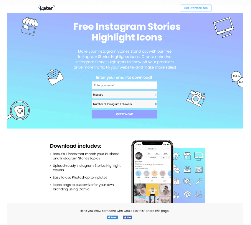
Here's a real fact: SaaS company name Later collected over 100,000 leads and achieved conversion rates of over 60% using gated landing pages.
Which completely makes sense that this is a fantastic way to grow your list, get more people excited about what you're doing, and create some serious buzz around your brand.
Now, if you're thinking about making one of these pages, you should definitely do it the right way.
The very first thing is to give your visitors something really good.
You want them to think, "Wow, this was worth my time!"
So, don't give them a deal on something that's not even super great.
Instead, you can offer them an eBook or a guide.
It's like saying, "Hey, sign up for my newsletter, and I'll give you this awesome thing!"
But wait, how do you actually make a great gated landing page for that?
Keep reading to find out!
Try Digital First AI's Plug & Play AI-Powered Marketing Workflows Builder

No credit card needed. Instant access. Try now for free.
Transform Your Lead Generation with Our Gated Landing Page Template
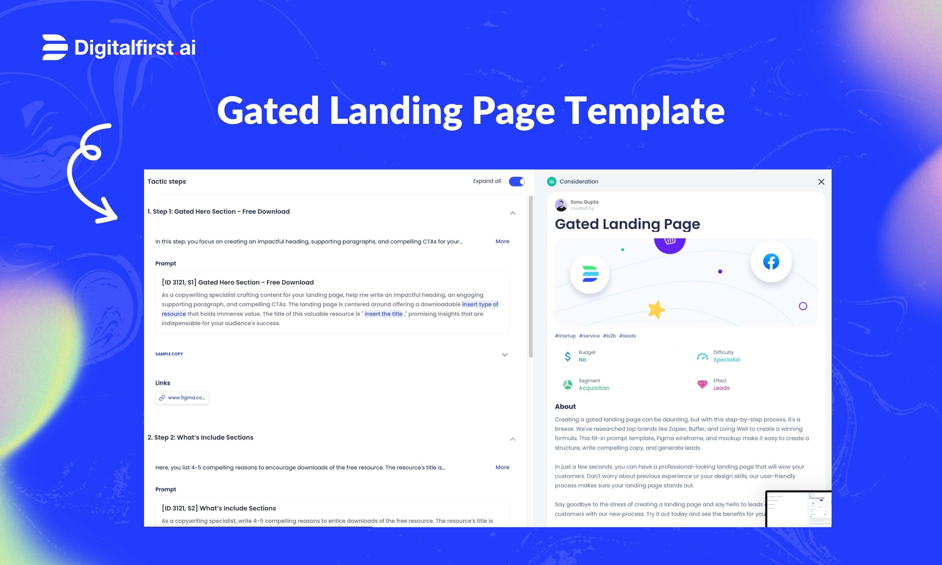
Transform your lead generation with our gated landing page template. This user-friendly template guides you through each step, making the process a breeze.
We've done the research and incorporated winning elements from top brands like Hubspot, Zapier, Buffer, and Living Well.
With our fill-in prompt template, Figma wireframe, and mockup, you'll have everything you need to create a compelling structure and generate high-quality leads.
Don't miss out on this game-changing opportunity to elevate your lead generation efforts.
Understanding the Importance of a Gated Landing Page
A lot of people think that a gated landing page is only about selling stuff.
However, there is more to it than that.
A gated landing page is a special tool. It's like a power-up that lets you share awesome things, like e-books, in exchange for people's info.
This special pages are important because of several reasons:
Get People Interested: Gated landing pages are like treasure chests. People need to give their info to open them, like joining a special club.
E-Books and More: Ever wanted an awesome ebook? Sometimes, you gotta sign up for it. That's a gated landing page at work.
Give and Take: You share cool stuff, like e-books. In return, visitors give you their details. It's like trading candy for secrets.
Build Your List: Use these pages to make a list of email friends. Send them stuff they like. They'll think you're the best.
Find New Friends: Gated landing pages help you find people who might love your stuff. Offer them something neat, and they'll give you their info.
Stay Friends: Stay in touch with possible buyers using these pages. Send them helpful tips. They'll trust you and want to know more.
Look Like an Expert: If you gather info using gated landing pages, people will think you're a pro. Especially if famous sites talk about your stuff.
There are many other importance of having gated landing pages. Just be sure to come up with a unique strategy that works for your business.
How to Create High-Converting Gated Landing Page
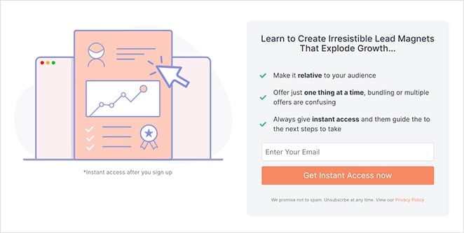
Here's everything you need to know about creating a high-converting gated landing page.
Step 1: Identifying Your Target Audience
To rock in business, you gotta know your fans.
And that means you have to know who your target audience is.
When people are looking for something, they don't want to be confused by options. They want to know exactly what they're getting from the get-go.
That's why the more you know, the better.
Here's a few ways you can do that for your gated landing page:
Use data analytics tools to gather insights
Get super smart tools that watch what people do on your website. See which pages they like, what they click, and how long they stay. This helps you make your site even better and give fans what they want. It's like having a secret map to their minds.
Social media listening
Hang out where your potential fans do—like social media. See what they post, what they like, and what they talk about. This helps you understand their interests and connect with them better.
Conversation with your existing customers
Have conversations with your existing customers. Ask them what they love about your stuff and what they wish was different.
Their feedback is pure gold for making your business even cooler.
Feedback from sales team
Talk to your sales team. They interact with customers daily and can provide valuable insights into customer pain points, objections, and preferences. This information guides your audience's understanding.
Step 2: Choosing the Right Resources
To start, you need to decide on the type of resource you want to create. Here are some high-performing options to consider:
Checklists: Provide actionable steps for your audience to follow.
E-books: Offer in-depth knowledge on a specific topic.
Whitepapers: Present research findings and insights.
Templates: Provide ready-made tools or designs for your audience.
If you're unsure where to start, try our checklist template. With our tool, you can brainstorm ideas, create content, and design your checklist in just a few minutes. We even provide prompts to spark your creativity based on your business.
Step 3: Wireframe and Write Compelling Copies
The next step is to wireframe your gated landing page to structure its layout. You can use design tools like Figma or any other suitable tool for this purpose. Once you have the wireframe, it's time to write captivating copies for each section.
To simplify this process, leverage the power of digital First AI. Our template includes pre-built sections, and we've carefully crafted prompts to help you write persuasive copies. Additionally, we've built and attached a Figma wireframe template in the tactic to make the entire process easier for you.
Remember, making design decisions after completing everything is like buying a car and then struggling to choose the color. It's better to make design decisions early to avoid costly mistakes down the road.
Step 4: Design the Landing Page
Making a design decision after everything is complete is like buying a car and then trying to figure out what color you want.
It's better to make design decisions as early as possible so you can avoid costly mistakes down the road.
Fortunately, you can create a well-designed eBook gated content page even if you're not a designer.
All you need is a little understanding of what works and what doesn't—so that when it comes time to designing an eye-catching gatekeeper experience for your visitors, the following elements are considered:
Visual Elements - Think of your visual elements as the superheroes of your page. These could be images, graphics, or even videos that align with your content. Make sure they're high-quality and relevant to your message. Visuals have a big impact, so choose ones that resonate with your audience and enhance their understanding.
Page Layout - magine your landing page is a storybook. How you organize the content on the page matters. Use headings, subheadings, and short paragraphs to make it easy to scan. Break up the text with visual elements to avoid overwhelming visitors. The layout should be clean, balanced, and guide the eyes naturally down the page.
Call to Action - Your call to action (CTA) is like a magic button that makes things happen. It could be "Download Now," "Get Your Resource," or something equally exciting. Make it stand out! Use contrasting colors that draw attention, and position it where visitors can't miss it. Keep the text action-oriented and tell them exactly what they'll get by clicking.
Step 5: Setting Up the Gating Mechanism
The gating mechanism is the thing you'll use to "gate" your content.
It could be a survey, an email signup, or even a simple prompt asking them for their email address.
Make sure it's as easy as possible for visitors to complete this step so that they can access what they're looking for.
And to gate your e-book download and collect user information, follow these steps:
Get a trustworthy email marketing software or a cool marketing automation platform. This tool will be your sidekick in this gating adventure.
Create a form to collect details from users. Name, email – the basics. This is how you'll stay in touch.
Set up an email wizardry. When someone gives their info, an automated email should pop up in their inbox. It's like a gift from you to them.
Step 6: Promoting Your Gated Landing Page
It's time to spread the word about what you have to offer, so that more people can see it for themselves.
That means that you have to promote your gated landing page you've created.
You can use any number of marketing strategies, including:
Distribute the content on social media platforms by sharing teasers or snippets of your resource.
Create blog posts or guest posts that contain links to your gated landing page.
Send targeted email campaigns to your existing subscribers.
Step 7: Tracking and Analyzing Performance
After you've launched your gated landing page with an eBook, it's important to track and analyze performance so that you can improve future conversions.
To measure the success of your gated landing page, consider these tactics:
Key Performance Indicators (KPIs): Think of these as your landing page report card. You want a high conversion rate (when folks do what you want), a solid click-through rate (how many clicks your button), and a low bounce rate (how fast people leave).
Use Analytics Tools: Ever wished you could read minds? Well, these tools help you get close! Google Analytics and heatmaps watch what visitors do on your page. See which parts they love, where they click, and where they bounce.
Optimize Like a Pro: After the mind-reading session, you'll know what's working and what's not. Then you make your page even cooler. Change buttons, make words catchier, or fix things visitors don't like.
User Journey Mapping: Imagine you're on a treasure hunt. With user journey mapping, you create a map of how visitors move through your page. This helps you spot where they're having fun and where they might be getting stuck. Fix those tricky spots and make the journey smooth.
A/B Testing: It's like trying out two different outfits to see which one gets more compliments. With A/B testing, you make two versions of your landing page with small changes. Then, you see which one people like more. This helps you figure out what changes make a big impact.
Examples of a Gated Landing Page
Now that you know what gated landing pages are, let's take a look at some examples of how they're used by different companies and what works best for each one.
Gated Landing Page of: Coursera
Offers “Exclusive insights from the global skills report” to a select group of people.
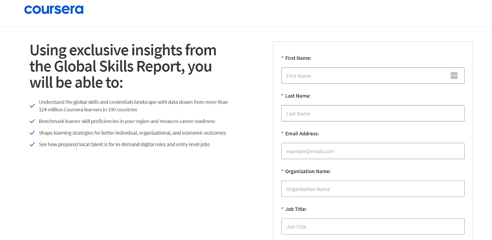
The above page is simple and easy to understand.
It provides users with the opportunity to sign up for free, which encourages them to provide their information in a given form—something that helps Coursera build its mailing list as well connect more easily with potential customers.
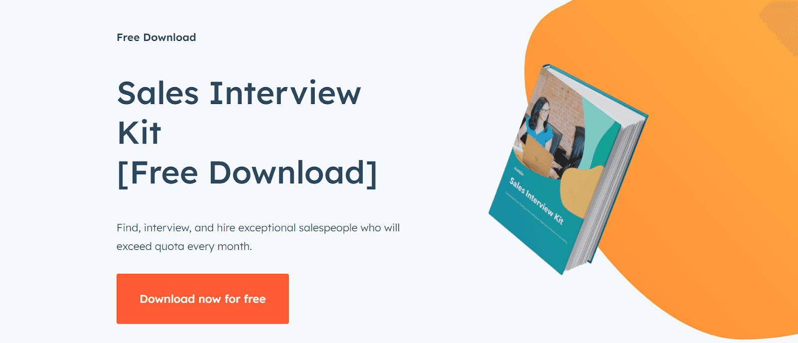
Gated Landing Page of: HubSpot
Offers a “Sales Interview Kit [Free Download]” to help salespeople get better at their jobs.
The page has a simple and clear structure, featuring three main journeys that guide the user through the lead conversion funnel.
It's a Wrap
At the end of the blog, if you read this far down in this essay, it means that I've already convinced you—you know what it takes to build a successful business: providing value for your customers.
So, the goal of gated landing pages is to ensure that you're providing them with the highest quality content possible in order to give them the best experience possible in exchange for their email address.
If you've done your job well, then they'll be happy to sign up for more of your content in the future!
FAQs
What are some best practices for creating a landing page for ebook downloads?
Here are some top tips:
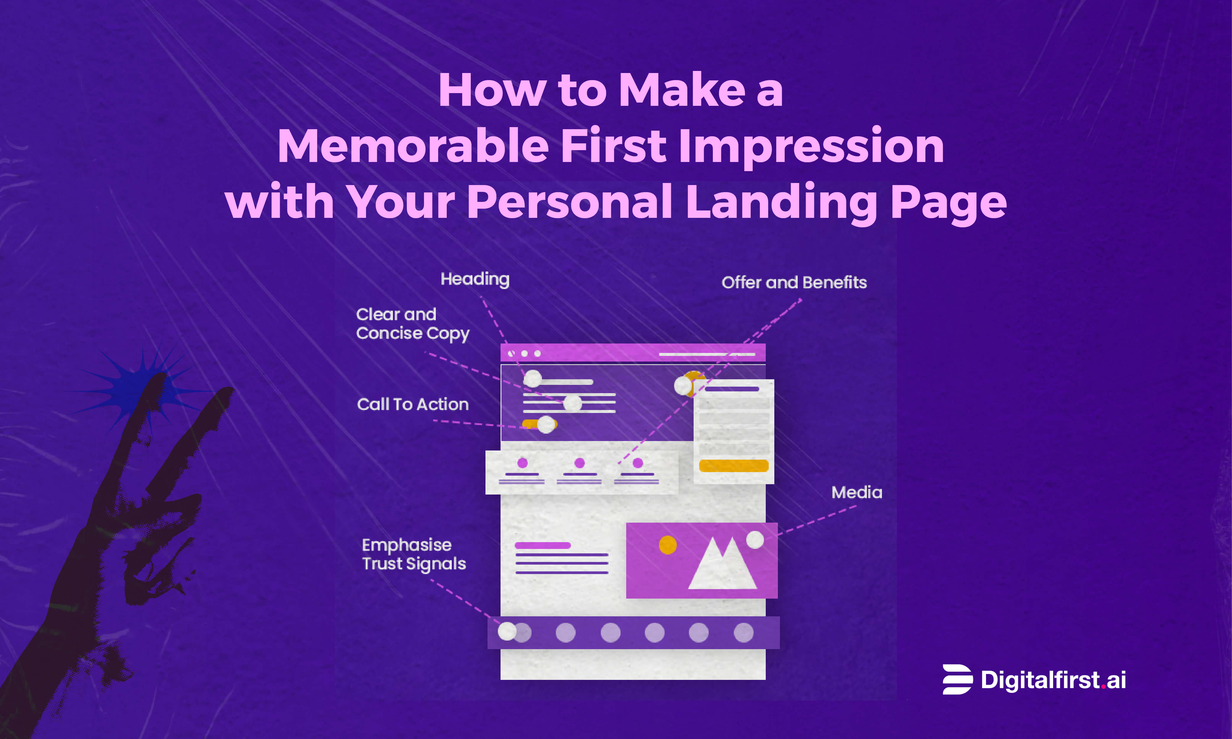
Clear Headline and Subheadline: Make it clear what your e-book is about and why it's awesome.
Eye-Catching Visuals: Use images or graphics related to your ebook to grab attention.
Benefits First: Explain how your ebook will benefit the reader right away.
Simple Form: Keep the form short and sweet. Just ask for essential info like name and email.
Call to Action (CTA): Have a button that stands out. Text like "Download Now" works well.
Trust Signals: Show testimonials or logos of companies you've worked with to build trust.
Mobile-Friendly: Your page should look great on phones and tablets.
Limited Navigation: Don't distract visitors with a bunch of links. Keep them focused on the download.
How can I optimize my landing page to convert more visitors into buyers?
Optimizing is key! Here's how:
A/B Testing: Try different versions of your page to see what works better. Change headlines, colors, or buttons.
Clear Message: Make sure your message is crystal clear. Visitors should know what they're getting.
Strong CTA: Use a strong action word in your button text. "Grab Your Copy" is more compelling than "Submit."
Scarcity or Urgency: Add a note like "Limited Time Offer" to encourage quick action.
Social Proof: Show reviews or stats that prove others found value in your e-book.
Fast Loading: Nobody likes waiting. Ensure your page loads quickly.
Easy Navigation: Keep your page simple. No need for extra links or distractions.
Responsive Design: Make sure your page looks good on all devices.
What are some effective templates for creating a landing page for ebooks?
There are various platforms that offer awesome templates:
Unbounce: Offers a range of customizable templates built for conversions.
Leadpages: Provides easy-to-use templates with proven track records.
Instapage: Offers sleek templates optimized for different goals.
Webflow: Provides templates that are both stylish and conversion-focused.
How can I create a landing page with a form to capture visitor information?
It's easier than you think:
Choose a Platform: Use tools like Unbounce, Leadpages, or even WordPress.
Pick a Template: Choose a landing page template that includes a form section.
Customize: Add your e-book's details, tweak colors, and make it match your brand.
Add Form Fields: Include fields for name, email, and any other info you need.
Connect to Email Service: Link the form to your email marketing tool to capture info.
Test: Check if the form works and looks good on different devices.
Publish: Once everything's set, publish your page for the world to see!
How can I use WordPress to create a landing page for my e-book?
WordPress is a great choice! Here's how:
Install a Page Builder Plugin: Plugins like Elementor or Beaver Builder make creating landing pages easy.
Choose a Template: These plugins offer pre-designed templates you can customize.
Add Form: Use a form plugin like WPForms to create your form.
Design and Content: Customize the template's design and add your ebook details.
Mobile-Friendly: Make sure your page looks good on mobile devices.
Optimize for Speed: Use a caching plugin to keep your page loading quickly.
SEO-friendly: Optimize your page's title, meta description, and URL.
Test and Publish: Check your page on different devices and browsers before hitting that publish button.
Build Marketing Workflows That Work for you

No credit card needed. Instant access. Try now for free
Digital First AI empowers marketers with AI-driven tools to centralize data, build personalized strategies, and execute campaigns seamlessly.
Generate content, automate workflows, and outpace competitors—all in one secure platform.
AI-Powered Data Room: Centralize and analyze unstructured data for actionable insights.
AI Strategy Canvases: Generate 26+ strategic canvases for tailored campaigns.
Advanced Research Tools: Conduct real-time market and competitor research.
AI Content & Visuals: Create high-quality copy and visuals with leading AI models.
Drag-and-Drop Workflow Builder: Design and automate custom workflows effortlessly.
Pre-Built Templates: Jumpstart campaigns with customizable templates.
Over 15,000 marketers and entrepreneurs from around the world are already reaping the benefits. Enjoy a free trial without any commitments!

