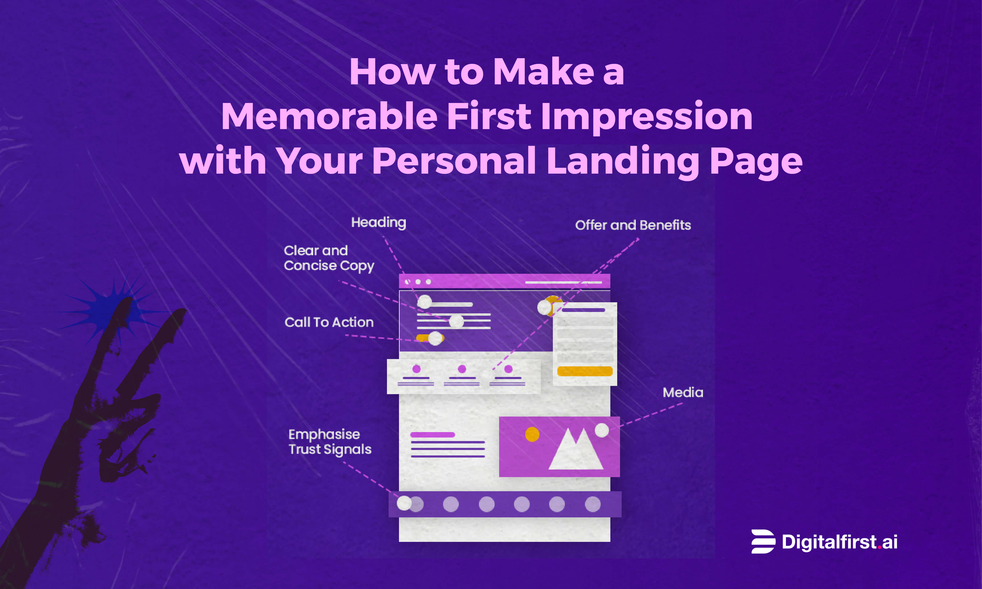
How to Build a Persona Landing Page That Speaks to Your Target Audience
Capture your audience's attention and drive more conversions with a persona landing page. Follow our step-by-step guide to create one that converts.
Sonu kalwar
Share:
Ever thought about how experts make special web pages for the people they want to reach?
If you have, you're not the only one.
Making these special pages that work well is like a kind of art.
It means you have to really know the people you're trying to talk to, and you also need to understand how people's minds work and how to advertise things online.
And with a very short time to grab someone's interest before they leave your site (usually within 10 to 20 seconds), it's not an easy thing to do.
So, what exactly is a persona landing page? and how can you create one?
To help you out, we've got everything you need to know about personas and how to create a persona landing page with examples.
Sounds good?
Then let’s dive!
Try Digital First AI's Plug & Play AI-Powered Marketing Workflows Builder

No credit card needed. Instant access. Try now for free.
Increase Conversion Rates with Our Persona Landing Page Template

Our step-by-step process, backed by research on top brands, ensures that your landing page copy engages and impacts your target audience.
Enhance your copywriting skills effortlessly and efficiently with our fill-in prompts.
Don't miss out on this valuable opportunity to drive astonishing results. Try it now!
Understanding Persona Landing Pages
Persona landing pages in marketing and web design is making special web pages for different kinds of customers.
Imagine that you have different groups of customers who like different things—and then make a page for each group.
These groups are like characters in a story, and we call them "personas."
We make special pages for each group that talk to their interests and problems.
For example, Clickup impressively showcases its expertise in catering to diverse target audiences through the creation of dedicated landing pages for various personas, including marketing, operations, IT, human resources and design.
Not only do these landing pages effectively address each group's specific pain points, but they also ensure that the messaging and content resonate with their unique needs.

The Purpose of Persona Landing Pages
Of course, the purpose of any landing page is to drive conversions.
But when we talk about persona landing pages—which are designed to provide a personalized and relevant experience for visitors who belong to that persona—we can increase engagement rates by making sure everything on the page resonates with them in some way.
These pages are designed to cater to specific groups of people/audiences, making sure that you're speaking directly to their needs and interests.
Let's break down why they matter:
Personal Connection: Persona landing pages make you feel understood. They use language and visuals that resonate with you, creating an instant connection.
Relevance: They cut through the clutter by showing you exactly what you're looking for. No more sifting through irrelevant information.
Clear Message: These pages get to the point. They tell you what you need to know without any unnecessary fluff.
Higher Conversions: When a page speaks your language and offers what you want, you're more likely to take action, whether it's signing up, buying a product, or exploring further.
Engagement: By addressing your specific needs, persona landing pages keep you engaged, preventing you from bouncing away.
Saves Time: No need to hunt around the website. Persona pages give you what you need, saving your time and effort.
Improved Experience: When a website understands you, it feels like a friend guiding you. Persona landing pages create a user experience that's enjoyable and efficient.
Key Components of Persona Landing Pages
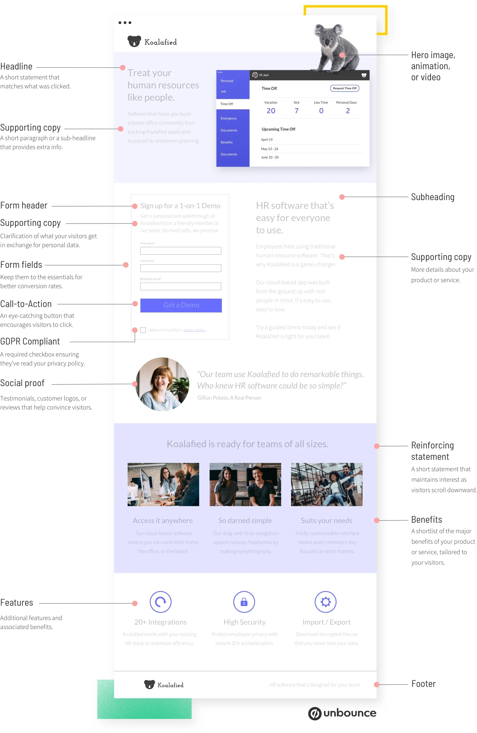
When creating landing pages for your personas, make sure they clearly show how the persona fits in with your product or service.
This means that including components about the persona's are very important.
And the most important components of persona landing pages are:
Headline
Your headline is like the "hello" of your landing page.
It needs to be attention-grabbing and crystal clear. A headline that resonates with your persona's pain points and aspirations can instantly create a connection and encourage them to keep reading.
For Example,
Asana, a collaboration and project management tool, provides solutions for many different sectors. However if we look at the marketing sector you can see that they have a specific persona; the busy marketing manager.

Their headline highlights the product's benefits: “Unite your marketing team to hit your most important goals.” which is exactly what this persona is looking for.
Also, encourage the marketer to pay for it—or at least stay engaged long enough to hear more!
Subheadline
The subheadline is like the "how can we help'' part of a conversation.
It’s where you elaborate on your headline, explaining how your product or service addresses your persona's specific needs—but in fewer words than the main body copy (i.e., it should be concise).
For Example,
If we look again at the same headline of Asana, we can see that it is accompanied by a subheadline: “Keep your team laser-focused on priorities, even as they change. Asana helps marketing leaders coordinate the initiatives that are most critical to the business.”

This shows that they can deliver on whatever their headline promises, and also makes it clear why people should believe what they're saying.
Hero Shot
A hero shot is worth a thousand words.
It's the first visual representation of your product or service that a visitor sees when they arrive on your site.
A compelling image or video that showcases your product in action can make a lasting impression and create that "I want this" feeling.
For Example,
Take, for example, these two images from the Swiss luxury watchmaker Longines.
Both of these brands are competing for the same market, but each uses a different style of imagery to showcase their product.
The image on the left shows a man wearing a watch with an air of confidence, while on the right depicts a woman wearing one in an elegant manner.


Both of these images are beautiful, but they give potential customers different ideas about what kind of lifestyle owning one of their watches will allow them to lead.
Benefits/Features
This is where you lay out the goodies.
What will your persona gain from choosing your product or service?
That's what you want to put in this section. This can be a list of features or benefits that make your product stand out from the competition, or it can be an explanation of how owning one will improve someone's life.
For Example,
Let's take a look at Miro, a visual collaboration platform for every team.


This set of images demonstrates some key benefits of using Miro, including being able to work together and solve pain points in multiple open tabs.
Call to Action
Your call to action (CTA) is the gentle nudge that tells your visitors what to do next.
Whether it's "Buy Now," "Sign Up," or "Learn More," your CTA should stand out and guide your visitors towards that conversion.
For Example,
If you're selling a product, this CTA might be "Add to Cart" or "Buy Now."
If you're promoting an event, it could be "Register Now."
If you're sending people to a website where they can learn more about your brand or products, use a CTA button that says "Learn More" or something similar.
Social Proof
Humans love validation, and that's where social proof comes in.
Customer testimonials, reviews, and success stories can build trust and show your persona that others have benefited from what you offer.
For Example,
Let's look at` Notion, which is used for project management and note-taking.

The image above shows how notions are used in a variety of industries, and the customer stories show that it helped many customers—potential users can find this motivating.
Creating Effective Persona Landing Pages
Creating an effective persona landing page is crucial for anyone who wants to capture the attention of their target audience.
It will help you build credibility, establish yourself as an authority in your industry, and position yourself as a thought leader.
You can use these steps to produce leads, or drive traffic with the creation of persona landing pages that appeal to your target audience and convert.
Identifying Your Target Audience
In order to create a persona that resonates with your audience, you must identify who they are.
Visualize their demographics and interests as well as pain points—and then solve those issues by designing an irresistible landing page based around what appeals most strongly to them.
Basic Demographics
Age
Gender
Location
Marital status
Education level
Occupation
Goals and Objectives
What are their personal and professional goals?
What do they want to achieve?
Challenges and Pain Points
What are their obstacles and frustrations?
What problems are they trying to solve?
Motivations and Values
What drives their decisions and actions?
What values are important to them?
Behavioral Patterns
How do they interact with technology?
Where do they spend their online and offline time?
Preferred Communication Channels
How do they like to receive information?
Which social media platforms do they use?
Buying Behavior
How do they research products/services?
What influences their purchasing decisions?
Jobs-To-Be-Done (Role and Responsibilities)
If relevant, what is their job title and responsibilities?
How does their role impact their needs and preferences?
Tech Proficiency
How comfortable are they with using technology?
Are they early adopters or do they prefer traditional methods?
Basically, the goal of creating personas is to have a clear picture of who your audience is so that you can tailor your marketing, product, or service accordingly to provide a personalized and relevant experience for visitors who belong to that persona, thereby increasing the likelihood of engagement and conversions .
Crafting a Compelling Headline
Your landing page's headline is the first thing your visitors see, so craft a compelling one that will keep them interested in what you have to offer.
Use power words, appeal to their pain points or highlight benefits of using your product/service—anything because a strong headline can make all the difference in whether a visitor engages with your page or leaves.
Choosing the Right Visuals
Visuals play a crucial role in capturing and retaining your audience's attention.
Choose images that align with your brand, are relevant to the subject matter at hand—and use high-quality material whenever possible.
Incorporating visuals that showcase your product or service in action can help build trust and credibility.
Highlighting the Benefits
Explain the value of your product or service to your audience.
Communicate how it can solve their problems and improve their lives. Use persuasive language to emphasize its benefits—don't just tell them why you think this is so great; show them!
Inserting bullet points or short paragraphs to make it easy for visitors to skim and understand the benefits quickly.
Creating a Strong Call to Action
Each persona landing page should have a clear and compelling call to action (CTA) that will guide visitors towards taking the desired action.
Use contrasting colors, place it strategically on your page—and use language targeted at each persona's interests.
Ensure that the CTA is relevant to what your visitors came to do on this landing page—whether it's making a purchase, signing up for a newsletter or starting a free trial.
Incorporating Social Proof
Including social proof on your persona landing page—such as testimonials, case studies, client logos or reviews from actual users of your product or service-can be a great way to boost credibility and trust in your brand.
Display positive feedback and experiences from satisfied customers to demonstrate the value and quality of your product or service.
Testing and Optimizing Persona Landing Pages
Once you have created your persona landing pages, the next step is to optimize them for each particular audience.
This means making sure that their design, copywriting and CTAs are tailored to meet these specific needs—rather than being generic or one-size fits all.
You can test different landing page strategies and make optimizations to gradually improve your conversion rate, like:
A/B Testing
A/B testing, also known as split testing, allows you to compare two or more versions of your persona landing page to determine which one performs better.
Here's how to use A/B testing on your persona landing pages.
Identify the element to test: Start by selecting a specific element on your landing page that you want to test, such as the headline, CTA button, or color scheme.
Create variations: Develop alternative versions of the selected element, making only one change at a time. For example, test different headlines or colors.
Split your audience: Direct a portion of your traffic to the original landing page (A) and the rest to the variation pages (B, C, and so on).
Gather data and analyze results: Monitor key metrics such as conversion rate, bounce rate, and time on page. Compare the performance of the different variations to determine the most effective one.
Implement the winning variation: Once you've identified the winning version, implement it as the default version for your persona landing page.
Conversion Rate Optimization
Conversion rate optimization (CRO) is the process of making strategic changes to your persona landing pages to increase the percentage of visitors who take the desired action.
Here are some ways to improve your conversion rate:
Conduct thorough research: Understand your target audience, their pain points, and motivations. Analyze user behavior data and identify areas of improvement.
Simplify the design: Streamline your landing page layout and eliminate distractions. Ensure that your CTA is prominent and easily accessible.
Improve copywriting: Craft persuasive and concise copy that highlights the benefits and addresses your audience's pain points. Use compelling headlines and clear, action-oriented language.
Enhance user experience: Optimize page loading speed, ensure mobile responsiveness, and create intuitive navigation. Make it easy for visitors to find what they're looking for.
Utilize social proof: Incorporate testimonials, case studies, or reviews to build trust and credibility. Showcasing positive experiences can increase conversions.
Continuously monitor and iterate: Regularly analyze performance metrics, gather feedback, and make iterative improvements based on data-driven insights.
Heatmap Analysis
Heatmap analysis lets you see how people navigate and interact with your persona landing pages.
This can reveal which elements are most important or attract particular attention from users—and help you optimize your content accordingly.
Here's how to use heatmap analysis:
Choose a heatmap tool: Use a reliable heatmap tool such as Microsoft Clarity, Google Analytics or Hotjar to track user interactions on your landing page.
Analyze click heatmap: This heatmap shows where users are clicking the most on your page. Identify if users are clicking on the elements that you want them to engage with, such as CTAs or form fields.
Review scroll heatmap: Understand how far users are scrolling down the page. Optimize your content placement to ensure key information is seen by most visitors.
Study attention heatmap: This heatmap shows which areas of your landing page receive the most visual attention. Ensure that important elements are within high-attention zones to increase engagement.
Make data-driven optimizations: Use the insights gained from heatmap analysis to adjust element placement, improve visibility, and enhance the overall user experience.
Some Examples of Effective Landing Pages
In the real world, let's examine a few of the best landing pages out there.
Webflow
The headline immediately hooks visitors, promising to take their design experiences to new heights.
The subheadline elaborates on the tool's capabilities, while the hero shot displays the Designer interface in action.
Benefits and features are neatly presented, along with a clear call to action to get started.
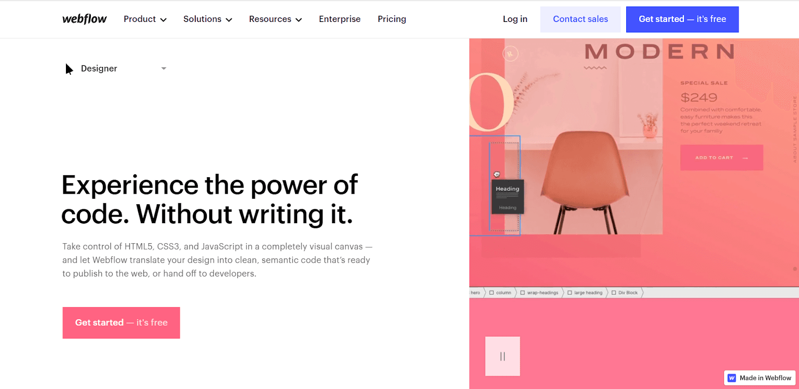
The page's visuals and concise language make it easy for visitors to understand the tool's value and take the next step.
Asana
Asana, a project management platform, makes this landing page tailored to marketers. The headline speaks directly to the pain points of marketers and offers streamlined workflows as relief.
The subheadline dives deeper into how Asana can improve marketing processes.

This hero shot showcases the persona using Asana, providing social proof from well-known companies and a prominent call to action that encourages visitors to start their trial. The landing page effectively highlights how Asana can solve marketing teams' specific challenges—providing feature descriptions as well as case studies so visitors know how it's been used in real life.
Notion
Notion, a collaboration and productivity platform, targets startups on this landing page.
The headline presents empowerment, a concept that appeals to entrepreneurs. The subheadline explains how Notion can be a game-changer for startups.
The hero shot displays the platform's interface, showcasing its flexibility.

A concise list of benefits and features follows, along with a strong CTA to get started. Notion's landing page effectively speaks to the needs of startups by highlighting its adaptability and collaboration features—two aspects that are especially important for companies in their early stages.
Miro
Miro, a collaborative online whiteboarding platform, targets design teams on this landing page.
The headline sparks curiosity by focusing on how design teams use Miro. The subheadline goes on to explain the tool's impact on design processes.
The hero shot demonstrates Miro in action, capturing the essence of collaboration.

Shown Number of users providing social proof, and benefits are presented in a visually appealing way. A CTA encourages visitors to explore further.
Miro's landing page effectively speaks to design teams' needs by showcasing its visual collaboration capabilities.
Tools to Create a Persona Landing Page
A persona-creation tool can help you organize all the information you've gathered about your personas by allowing you to create landing pages for each one.
It makes it easier for others in your organization to understand who they're talking about when discussing marketing efforts.
Few of the tools for different purposes are:
Digital First AI: Digital First AI is an powerful AI-powered marketing tool that helps you create effective and engaging marketing campaigns in minutes. Discover actionable tactics for landing pages, our step-by-step process, backed by research on top brands, ensures that your landing page copy engages and impacts your target audience.
Figma: Figma is a collaborative design tool that allows you to create beautiful and interactive designs for your persona landing page. With its intuitive interface and powerful features, you can easily create visually appealing layouts and prototypes.
Miro: Miro is a collaborative online whiteboard platform that enables you to visually plan and design your persona landing page. With its extensive set of features and pre-made templates, you can easily brainstorm ideas, create wireframes, and collaborate with your team.
Webflow: Webflow is a popular CMS that offers a visual interface for designing and building websites, including persona landing pages. It provides flexibility and customization options without requiring extensive coding knowledge.
WordPress: WordPress is a widely used CMS that offers numerous themes and plugins to create and publish persona landing pages. With its user-friendly interface and extensive community support, you can easily set up and manage your landing page.
Unbounce: Unbounce is a landing page builder designed specifically to create high-converting landing pages. It offers drag-and-drop functionality, A/B testing, and integration with other marketing tools.
Hotjar: Hotjar is an all-in-one analytics and feedback tool that allows you to conduct A/B tests on your persona landing page. It provides insights into user behavior with features like heatmaps, session recording, and feedback polls.
VWO (Visual Website Optimizer): VWO is a comprehensive A/B testing and conversion optimization platform. It enables you to create variations of your persona landing page, track conversions, and analyze the results to make data-driven decisions.
Midjourney: Midjourney is a stock photography website that offers high-quality and diverse images suitable for persona landing pages. It provides a wide range of topics and styles to choose from.
Unsplash: Unsplash is a popular platform that offers a vast collection of free, high-resolution images. It provides a wide selection of visually appealing images for your persona landing page.
Build Marketing Workflows That Work for you

No credit card needed. Instant access. Try now for free
Digital First AI empowers marketers with AI-driven tools to centralize data, build personalized strategies, and execute campaigns seamlessly.
Generate content, automate workflows, and outpace competitors—all in one secure platform.
AI-Powered Data Room: Centralize and analyze unstructured data for actionable insights.
AI Strategy Canvases: Generate 26+ strategic canvases for tailored campaigns.
Advanced Research Tools: Conduct real-time market and competitor research.
AI Content & Visuals: Create high-quality copy and visuals with leading AI models.
Drag-and-Drop Workflow Builder: Design and automate custom workflows effortlessly.
Pre-Built Templates: Jumpstart campaigns with customizable templates.
Over 15,000 marketers and entrepreneurs from around the world are already reaping the benefits. Enjoy a free trial without any commitments!
It's a Wrap
To sum up, Persona is a simple character that helps you—yes, you—create great landing pages for your leads (potential customers).
And now that you have the knowledge of creating personas and are vital in making the final sale to users on your site, and more importantly they help you collect information about what works and what doesn’t when it comes to landing pages.
Now that you know how to create a persona and use them in your marketing strategy, go out there and make some sales!
FAQs
What are the essential elements of a successful landing page?
A successful landing page should include the following essential elements:
Captivating headline that grabs visitors' attention.
Compelling visuals that resonate with the audience.
Clear benefits and value proposition of the offering.
Strong and persuasive call-to-action to encourage conversions.
Social proof such as customer testimonials or case studies.
How can I optimize my landing page for conversions?
To optimize your landing page for conversions, consider the following tips:
Craft a persuasive headline that speaks directly to your audience's pain points.
Highlight the key benefits of your offering prominently on the page.
Use an eye-catching and visually appealing design.
Simplify the user experience by removing any unnecessary distractions.
Create a clear and compelling call-to-action that stands out.
What are some best practices for designing a landing page?
When designing a landing page, it's important to follow these best practices:
Keep the design clean and simple, with ample white space for readability.
Use contrasting colors to draw attention to important elements.
Ensure that the page is mobile responsive for a seamless user experience.
Use high-quality images and visual elements that reinforce your messaging.
Test different variations of your design to see what performs best.
What are some common mistakes to avoid when creating a landing page?
Avoid these common mistakes when creating a landing page:
Having a weak or generic headline that fails to grab attention.
Overwhelming visitors with too much information or a cluttered layout.
Neglecting mobile optimization, leading to a poor user experience.
Using generic stock images that don't resonate with your target audience.
Having a confusing or unclear call-to-action that doesn't guide visitors towards conversion.
How do I choose the right landing page template for my campaign?
When choosing a landing page template for your campaign, consider the following factors:
Understand your target audience and their preferences.
Align the template with your brand identity and messaging.
Ensure that the template includes all the necessary elements for a successful landing page, such as a compelling headline, clear benefits, and a strong call-to-action.
Test different templates and variations to see which ones perform best for your campaign.

